
By Jim Dalglish
Associate Director of Research & Information Architecture
With more and more people regularly accessing the Internet from hand-held devices, what can you do to guarantee your website is optimized for mobile?
There's a new approach to mobile research and testing that is faster, easier, cheaper and more accurate than the old school paradigm.
Mobile Use is Growing – Fast
Why is it so important for your organization to optimize for mobile? Easy. Mobile usage is growing astronomically. As of this past summer:

- 17% of all web page views across the globe were being accessed by mobile devises. (StatCounter)
- 63% of Americans with smart phones regularly used their phones to go online. (Pew Research Center)
- 20% of smartphone users used ONLY their mobile devises to go online. (Pew Research Center)

The numbers are expected to continue their upward climb. Clearly, if your web content can’t be delivered effectively on a hand-held device, you’re behind the game.
Designing for Mobile
Designing for mobile is different from designing for desktop. Take something as simple as your mail program on your phone. When you pick up your iPhone and open the email app, do you expect it to look and function the same way as the mail app on your desktop?
Of course not.
Why? Because a team of intelligent people at Apple realized that the smaller screen size of mobile devices required different interfaces to achieve the same quality experience provided on a desktop.
The same applies to websites. Is a website that’s been shrunken down to fit into a mobile screen - with no changes to its navigational structures or content – the best experience for mobile users?
Of course not.
Yet it’s still pretty common to see “Minnie Me” websites on mobile devices – much to the frustration of mobile users.
From our research at OHO we’ve been able to draw three general conclusions about what users want and expect from websites accessed on their mobile devices.

Desktop Testing Fails for Mobile Devices
How did Apple know what to change when they optimized their mail program for their mobile devices? A lot of user testing… conducted on the mobile devices themselves, of course.
Testing a mobile interface on a desktop computer doesn’t cut it. Just a few of the reasons:
- Roll-overs – You can’t “roll-over” on a mobile touch device. If you use roll-overs to trigger navigation or content on your desktop version they won’t automatically translate to mobile devices.
- Re-sizing – The very nature of the smaller mobile screen means that you need to test re-sizing for photos, design elements, head structures and running text.
- Overlays and Pup-ups – Features such as light boxes and slide shows that use overlays or popups can lead users into navigational dead ends on mobile devices.
- Location Services, Video, etc. – If you capitalize on the mobile device’s features (which you should) you will not be able to test them on a desktop machine.
- Environmental Factors – Mobile devices are used in a much wider variety of environments.
- You will want to test your designs – color choices and textures – in a variety of environmental light settings.
- Test Where/When Your Customers Use – If you are tied to a desktop environment for your testing, you will never be able to assess how your websites are used when and where the user uses them.
Mobile Testing Can Be Difficult & Expensive
Knowing that it’s dumb to test your interfaces solely on a desktop computer, you’ll have to set aside time to do it right using a mobile device. Unfortunately most organizations aren’t set up to conduct this basic research. And if they are, they use awkward phone “harnesses” and dongles and multiple video cameras that constrain the test taker in a desktop environment.
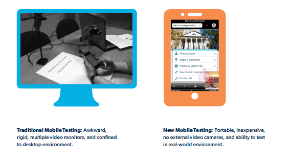
Traditional Mobile Testing: Awkward, rigid, multiple video monitors, and confined to desktop environment.
Post-production expense of synching video and screen captures for traditional mobile testing is time-intense and expensive. Using this old-fashioned approach, a test can take weeks to conduct and cost several thousand dollars.
But there’s a better way.
Quicker, Cheaper, More Accurate Mobile Testing
There's a new approach to mobile research and testing for websites that will not only get you more accurate results, but it will save you time and expense as well.
Advantages of this new approach:
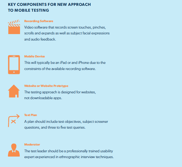
- No External Video Cameras – You can now use software that records screen captures – touches and clicks – as well as video and audio of the subject as he/she performs each task.
- Completely Portable – Because no video cameras are required, the phone does not have to be tethered to a carriage or harness.
- Testing in Real-world Environments – You can test websites wherever the subject regularly uses them. Example: If you are a retailer, you can test your customers as they use their phones in your stores.
- Quick Turnaround – You don’t need to spend a lot of time syncing two or three video files in order to view the mobile screen, the testing environment and the subject’s facial reactions. Testing – planning, testing and reporting – can be completed in as short as three days.
- Inexpensive – The short turn-around, elimination of excessive video editing and the ability to go directly to the user’s environment means allows OHO pass those savings off to our clients.
How Do You Do It?
My next blog post will further outline the steps and software you will need to conduct a mobile usability test in the real world.